Gone
MY ROLE: LEAD UI/UX Designer
My responsibilties for this project included wire-frame & user flow design, visual design,
interaction design, prototyping, user testing, and quality assurance.
Mobile application design
The concept for this app is that sellers simply provide a picture, and Gone intelligently handles pricing, last-mile logistics, warehousing, marketplace listing, and payment processing. Buyers on Gone’s forthcoming marketplace will browse a curated collection of fully inspected and warrantied used items with detailed images and descriptions and significant discounts.
According to Nielsen, American households have $3,100 worth of unused purchases hidden in drawers and closets. Gone’s suite of services unlocks this value by removing the research, shipping, and buyer interaction challenges for sellers and delivering riskless, quality-assured used items to buyers.
The client requested that the UI be colorful and modern looking, yet simple and intuitive. At the time I designed this UI, Apple's and Google's shift from skeuomorphism to flat design was really taking off in the design world, and the client definitely wanted to take advantage of those cues.
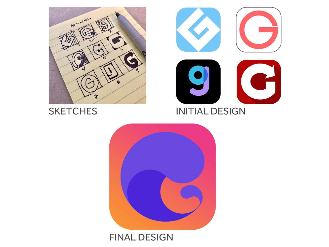
App Icon Design
Creating that one, singular piece of graphic design that users will interact with each time they see your product can be an intimidating task. A beautiful, identifiable and memorable app icon can have a huge impact on the popularity and success of an app. As always, my approach is sketch first, apply some design, then fine tune with feedback. Oh, and iterate, iterate, iterate.
Early Mockup Screens
My early screens. They were a good starting point, but the client wanted more.....or less, rather. At this stage, there was no brand style guide, which needed to be created to get us to the final design. Drumroll....


